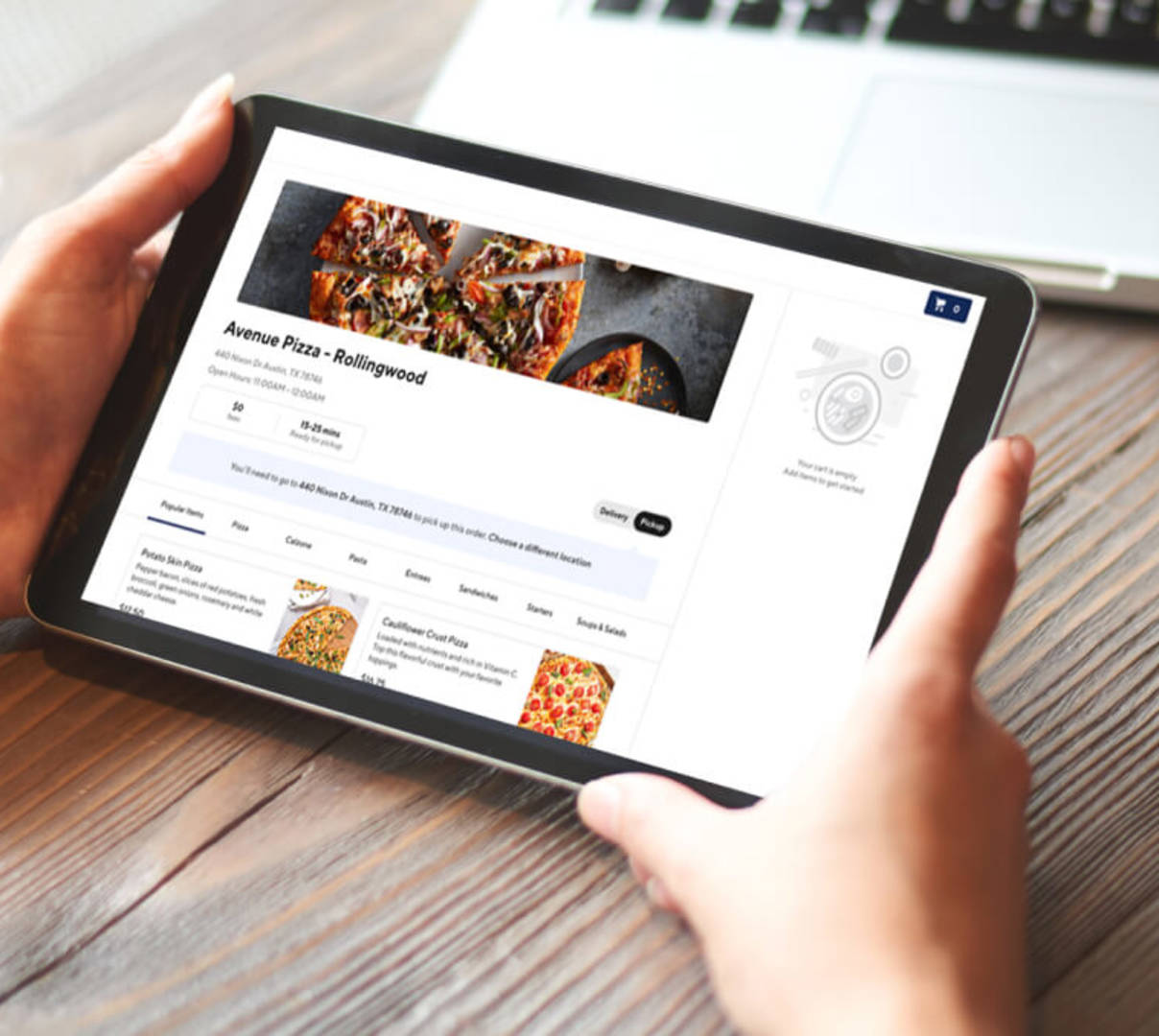
A strong restaurant website design is a must in the modern age. Today, 23% of consumers say they go to a restaurant's website or app when deciding whether to place an order — yet 20% of restaurants don't even have a website. Meanwhile, 76% of restaurant owners say DoorDash Online Ordering has helped them grow their business. For restaurant marketers, the options are clear: get online, or fall behind.
But it's not enough to just build your site. There are many ways a website can go wrong — poor user experience, generic text, and menus that fail to include ingredients, photos, or even prices. Luckily, these restaurant marketing mistakes are all completely avoidable.
Ready to create a restaurant website that converts prospective diners into paying customers? Here are six tips for getting started with your website upgrade.
Components of great restaurant website design
Local SEO strategy in place
SEO is a secret ingredient for strong restaurant marketing. When prospective customers type food-related keywords into Google (think: "sushi near me," "best Austin BBQ," or "Boston seafood restaurant"), businesses with strong SEO rise in search engine rankings — and are found sooner.
One easy strategy for boosting your SEO rankings is including keywords in page titles and descriptions. Fortunately, many web hosting platforms have tools — like the Wix SEO Wiz — to help you identify relevant keywords, add alt text to images, and more. You can also use sites like SEMRush or Woorank to spot keyword weaknesses — and even monitor competitors' SEO strategies. Optimizing your Google Maps and Google My Business listings is another important SEO strategy, since it serves as a sort of homepage for local consumers to learn more about your business, cuisine, reviews, and location.
Mobile-friendly website design
Today, mobile responsiveness is critical for restaurant websites.
Most website builders, like Squarespace and Wix, are designed to be mobile-friendly. No matter which platform you choose, it's worth previewing your site on mobile before sharing it with the world.
Keep in mind that phone screens are much smaller than computer screens, and audiences don't want to scroll forever on their smartphones to find important information. Concise web copy makes for a more enjoyable user experience — so opt for bite-sized snippets over wordy text blocks.
Optimized menu
When it comes to online menus, PDFs are not your friend. If you want customers to find your restaurant when searching for specific keywords like "poutine," "acai bowl," or "tapas," your best bet is having a text-based webpage for your menu, which is much better for SEO.
Be sure to include clear descriptions and prices for each menu item. If any dishes are locally sourced, let customers know. For example, sprucing up your descriptions from simply "oysters" to "Little Peconic Bay oysters on the half shell" tells more of a story.
Finally, remember to keep customers posted with any seasonal menu updates, such as warm winter soups, fresh spring salads, cool summer cocktails, or spiced fall lattes. As the weather changes, so do menus — and your restaurant web design should always reflect your latest offerings.
Integrated online ordering
In 2024, 70% of consumers said they ordered restaurant food delivery in the last month, with 36% preferring to order from a restaurant's website or app. Customers have spoken: Online ordering is here to stay.
All DoorDash partners get access to Online Ordering, which enables restaurants to build their brand and acquire new regulars with commission-free online ordering done directly through your own channels.
When designing your restaurant website, be sure to include a Smart "Order Now" Button displayed on every page like the Middle Eastern eatery Naan & Kabob does in the screenshot below. This way, site visitors can clearly see your call to action. In one click, prospective diners will be on your Online Ordering page — one step closer to becoming a customer.
Some of the best restaurant website design examples

Naan & Kabob: Mouthwatering menu photos on their homepage help this Afghan restaurant entice customers. Learn how they increased weekly sales by an average of 214% with Online Ordering.

Pacific Catch: A personalized homepage reel transports customers to California's sandy beaches.
Popular restaurant website builders
Drive sales with a strong restaurant website design
As technology advances, customers will continue searching for food options online. By following these restaurant website design tips, your business can attract diners across your own digital channels.
Curious how Online Ordering works in the real world? Learn how Illinois-based grilled chicken franchise Port of Peri Peri increased orders by 56% with Online Ordering.

"So many people look at restaurant menus online. Online Ordering helps us capture those customers by providing a convenient ordering experience — without spending a penny on advertising or commission."
Ready to build your brand and grow sales across your own channels with commission-free ordering? Schedule a demo to learn more about how Online Ordering can work for your specific restaurant.


